


Container queries are a groundbreaking addition to CSS, enabling developers to apply styles based on the size of a container rather than the viewport. This technique provides greater flexibility in responsive design, making it easier to create adaptive and dynamic layouts. In this article, we will explore how to use container queries now and understand their significance in modern web development.
What are CSS Container Queries?
It allow you to apply CSS styles to an element based on the size of its container. Unlike media queries, which target the viewport size, and focus on the parent element. This approach enables more granular control over the design, especially in complex layouts where components need to adapt independently.
Why Use it?
Improved Flexibility:
It offers more flexibility in designing responsive layouts. Elements can adjust their styles based on the size of their parent container, allowing for more precise and adaptive designs.
Modular Design:
Components can be designed to be more modular. This means that they can be reused across different parts of a website or application without worrying about the overall layout.
Enhanced User Experience:
Developers can ensure a more consistent and optimized user experience across various devices and screen sizes.
How to Use it?
First of all, you need to ensure that your browser supports them. As of now, most modern browsers have partial or full support for container queries.
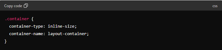
Step 1: Enable Container Query
First, ensure that your CSS file includes the necessary syntax for container queries. Here’s an example of how to enable it:
Step 2: Apply Styles Based on Container Size
Next, you can apply styles to elements inside the container based on its size. Here’s an example:
In this example, the .item class will have different font sizes depending on the width of its container.
4 Amazing Services to Bring Your Vision to Life
Best Practices for Using Container Queries
Plan Your Layouts:
When designing with container query, plan your layouts carefully to ensure that styles adapt correctly based on container sizes.
Test Across Devices:
Test your designs across various devices and screen sizes to ensure that the queries work as expected.
Combine with Media Queries:
While container query provide more control, combining them with traditional media queries can offer even greater flexibility and adaptability.
Finally
Container queries are a powerful tool in modern web development, providing greater control and flexibility in responsive design. By using container queries, developers can create more adaptive and dynamic layouts that enhance the user experience. Start using container query now to take your web designs to the next level.
Our Social media platforms:
Facebook – Facebook ME – Instagram – LinkedIn – LinkedIn ME