

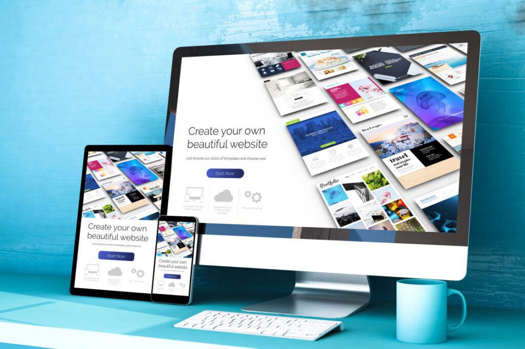
In today’s mobile-centric world, having a website that adapts seamlessly to different devices is no longer a luxury, but a necessity. Enter responsive web design – a design approach that ensures your website looks and functions flawlessly across various screen sizes and devices.
Why is Responsive Web Design Important?
1. Enhanced User Experience:
Responsive web design prioritizes user experience by providing a consistent and optimized browsing experience, regardless of the device being used. Whether your visitors are browsing on a smartphone, tablet, or desktop, a responsive website ensures that they can easily navigate, read content, and interact with your site, leading to increased engagement and customer satisfaction.
2. Improved Mobile SEO:
Search engines like Google have placed great importance on mobile-friendliness as a ranking factor. With a responsive website, you can ensure that your site meets Google’s mobile-friendly criteria, giving you a better chance of ranking higher in search engine results. This means more visibility, organic traffic, and potential customers finding your website.
3. Cost and Time Efficiency:
Maintaining separate websites for desktop and mobile can be costly and time-consuming. However, with responsive web design, you only need to manage and update one website, reducing development and maintenance costs. Additionally, updates and changes can be implemented more efficiently since they only need to be done once. This frees up resources that can be allocated to other areas of your business.
4. Future-Proofing Your Website:
The mobile era is here to stay, and the number of mobile users is only growing. By implementing responsive web design, you future-proof your website and ensure that it remains accessible and usable for years to come. As new devices with varying screen sizes emerge, your website will adapt seamlessly, keeping your business ahead of the curve.
In order to achieve an effective and visually appealing responsive website, consider these best practices:
- Mobile-first approach: Start designing for mobile devices and then scale up to larger screens. This ensures a smooth and optimized experience for mobile users.
- Fluid grids and flexible layouts: Use relative units like percentages and ems to create flexible and fluid layouts that adapt to different screen sizes.
- Media queries: Utilize CSS media queries to apply specific styles and layout adjustments based on the user’s device screen size.
- Optimize images: Optimize image sizes and use responsive images to ensure fast loading times on mobile devices.
- Touch-friendly design: Ensure that buttons, links, and interactive elements are large enough and properly spaced for easy tapping and navigation on touchscreens.
Remember, responsive web design is not a one-size-fits-all solution. It’s Important to understand your target audience, their devices, and their browsing habits to create a tailored and optimized responsive experience.
So, embrace the power of responsive web design and unlock the potential of reaching and engaging with your audience across all devices. Stay ahead of the mobile era, and watch your website thrive!